
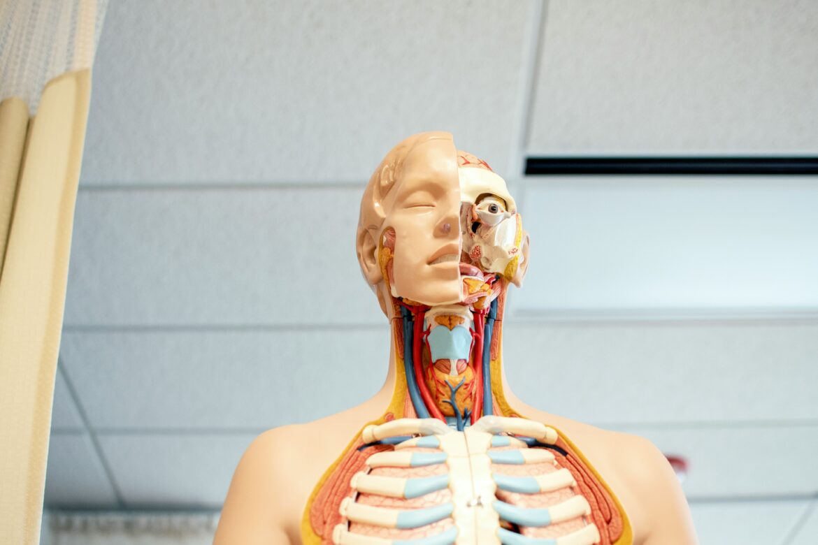
Better anatomy visuals start with less information, clearer learning goals, and more opportunities for students to test themselves. A detailed diagram may look impressive, but it can quickly become a maze of labels, colors, and unfamiliar structures.
Effective materials guide the eye instead of asking students to decide where to look. The following steps can help anatomy educators turn complex content into focused, reusable resources that support comprehension and recall.
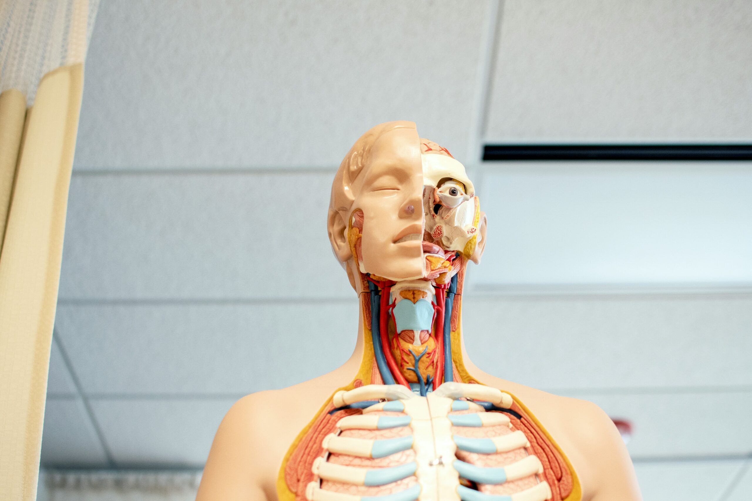
Start with a Clear Learning Goal
Choose one learning objective before opening a design tool or selecting an anatomical image. Every diagram, label, caption, and color should help students achieve that objective without adding unnecessary mental work.
A broad topic such as the nervous system is too large for one visual. A narrower goal, such as tracing the path of a sensory signal, gives the material a clear direction and makes it easier to decide what belongs on the page.
Use a few planning questions before designing the resource. Decide what:
- Students should identify or explain
- Prior knowledge students will need
- Details can wait until a later lesson
Clear goals also make it easier to create a sequence of related visuals. An educator might begin with a simple overview, add labels in a second version, and introduce clinical details only after students understand the core relationships.
Simplify and Standardize Every Anatomy Image
Remove anything that does not support the learning objective. Decorative backgrounds, repeated explanations, dense legends, and labels for unrelated structures can compete with the information students actually need to remember.
Consistency matters just as much as simplicity. Reusing the same fonts, line weights, viewpoints, colors, and label styles helps students concentrate on anatomy rather than decoding a new design system on every page.
A simple style guide can cover several practical choices:
- Use one font family throughout the resource
- Keep leader lines thin and easy to follow
- Place labels in predictable areas
Image quality should remain high enough for zooming, projection, printing, and online study. Educators may also need to separate useful diagrams from longer reports, handouts, or laboratory records before sharing them with a class.
Choosing the right file format can make visual resources easier to organize and share. A flexible format also helps educators reuse materials across different platforms and activities.
Canva allows users to create a JPG from any PDF with its free converter. Converting files can make diagrams easier to embed in course websites or place in digital worksheets.
Standardized file names can further reduce confusion. Names that include the body system, view, and difficulty level help students find the right material quickly when reviewing several units.
Use Color and Labels to Direct Attention
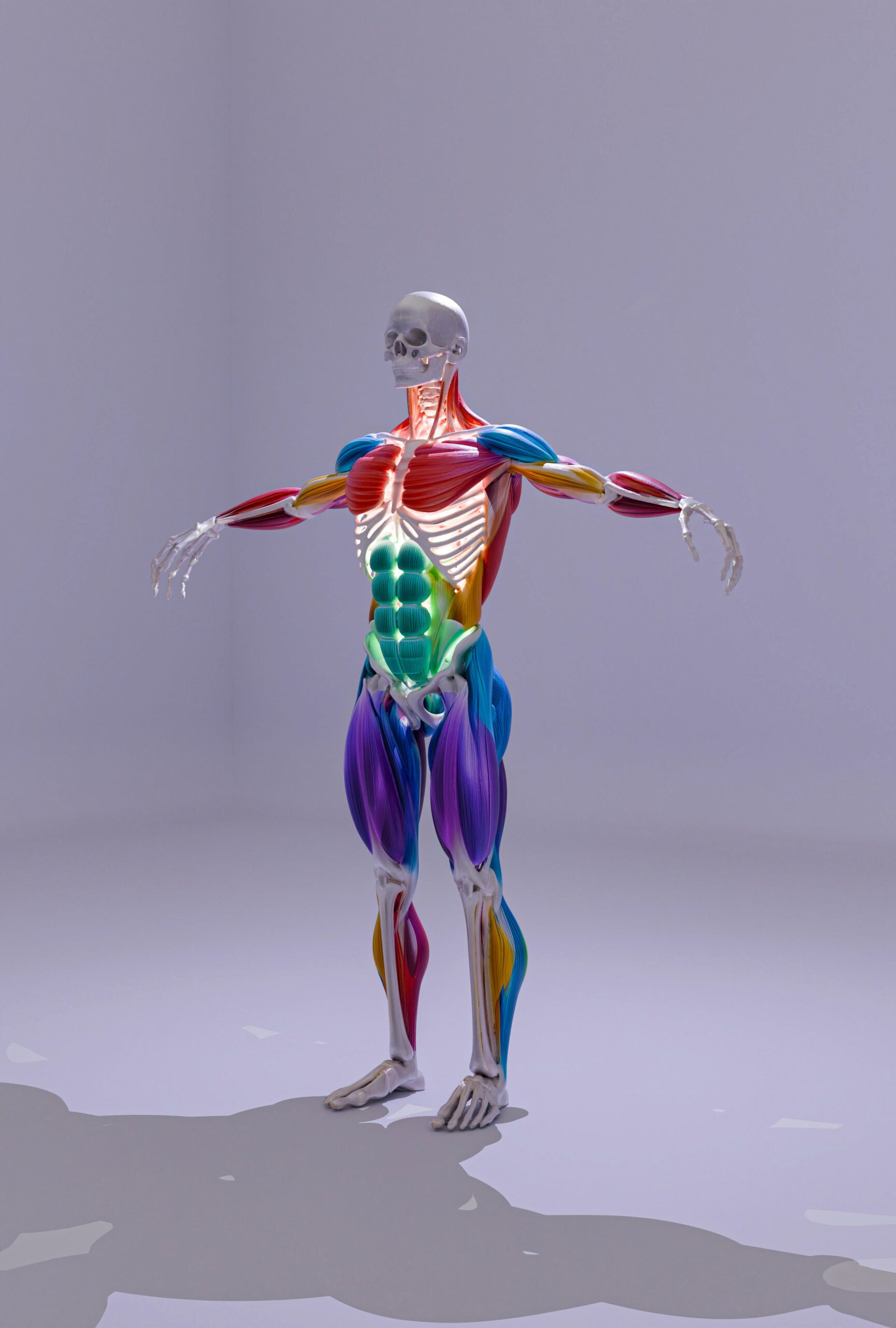 Apply color as an instructional signal rather than decoration. A limited, consistent palette can show relationships between structures, distinguish tissue types, or help students follow a pathway from one region to another.
Color choices should remain consistent across lectures, worksheets, and assessments whenever possible. If arteries appear red in one resource and purple in another, students may spend valuable attention interpreting the change instead of reviewing the structure.
Useful color systems can assign clear roles to each shade:
- Highlight the current structure with one accent color
- Fade surrounding structures into neutral tones
- Reserve warning colors for clinical risks
Carefully applied color can make realistic and visually complex images easier to navigate.
Also, labels should sit close to the structures they identify. Long crossing lines force students to move their eyes around the page, increasing the chance of connecting a term to the wrong feature.
Accessibility must remain part of the design process. Strong contrast, readable text, patterns, symbols, and direct labels ensure that meaning does not depend on color alone.
Design Visual Study Materials Around Active Recall
Turn each image into something students can use, not merely view. Blank labels, hidden captions, matching exercises, and step-by-step pathways encourage learners to retrieve information instead of repeatedly rereading it.
Create both labeled and unlabeled versions of key diagrams. Students can study the complete version first, attempt the blank version from memory, and then compare their answers without needing a separate resource.
Active-recall formats can include several simple variations. For instance, you could:
- Number structures for a matching activity
- Remove selected labels for self-testing
- Ask students to redraw one relationship
For students, active tasks turn a polished anatomy image into practical exam preparation. For educators, reusable templates make it possible to change the difficulty level without rebuilding the entire resource.
Feedback can reveal whether a visual is genuinely supporting recall. Ask students which labels were unclear, which images felt crowded, and where they needed an additional view before revising the next version.
Show Structures from Multiple Anatomical Views
 Present important structures from more than one angle so students can build stronger spatial understanding. A learner who recognizes an organ from an anterior view may still struggle to identify it from a lateral, posterior, or cross-sectional perspective.
Keep the visual style consistent as the viewpoint changes. Matching colors and labels across each image helps students recognize the same structure without mistaking a change in orientation for a different anatomical feature.
Include a balanced range of perspectives. For example, you could:
- Pair anterior and posterior views
- Add cross-sections at key levels
- Mark orientation with simple directional labels
Move from familiar views to less familiar ones in a logical sequence. Educators might introduce a standard textbook view, rotate the structure, and then connect it to a medical image or realistic specimen.
Short comparison prompts can make the sequence more useful. Ask students to identify what moved out of view, which structures became visible, and how neighboring relationships changed between angles.
Multiple perspectives can also prepare students for laboratory work and image-based assessments. Regular exposure to varied orientations helps learners recognize anatomy as a three-dimensional system rather than a collection of flat diagrams.
Helping Students See Anatomy More Clearly
Strong visual study materials do not need to contain every possible detail. They need a focused purpose, a consistent design, meaningful visual cues, and activities that encourage students to retrieve what they have learned.
Anatomy educators can begin by improving one diagram or worksheet from an upcoming lesson. Then, use student performance and feedback to guide later revisions.
Written by info@sixdollardigital.com